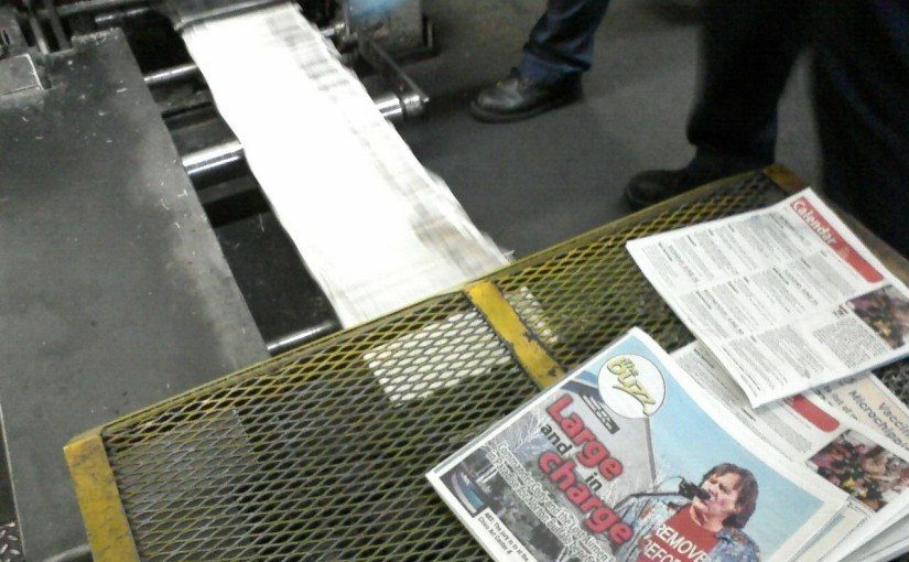
Today marks the launch of The Buzz with a fresh facelift. The new design is geared to offer a cleaner, more dynamic look at the area’s lively arts. While the look is streamlined, all of The Buzz’s regular features are there. We also have updated ways to browse upcoming movies and events.
Please take a look — either in print or with the samples below. As the designer who oversaw the process, I’m excited by the end result and I hope you will be as well.
| Old design (click to embiggen) | New design (click to embiggen) |
Opening pages up: Since we launched the old design years ago, we had changed how tall Buzz pages were and the design was starting to feel cramped. It was time for a flexible design that looked great.
Last December, I sat down on a Saturday and took the previous edition of The Buzz. Using a concept page that I have previously designed, I spent several hours redesigning the section. I moved elements around, updating fonts and styles and seeing how everything fit. After some tweaking and input from others, it became the blueprint for the new design and launched with the arrival of our new Buzz editor Jammie Salagubang.
Here are the music pages from the old and new designs. The new design opens up the entire width of the page for photos and articles (it was very difficult to have side-by-side articles in the old design). Some of the new pages explode with color.
| Old design (click to embiggen) | New design (click to embiggen) |
New elements: In the old design, the calendar and movie capsules had interesting information for people looking for stuff to do on weekends, but the presentation was mostly a sea of grey text.
The new movies section features a “What’s Playing” guide. At a glance, readers can see all the movies playing at every theater. There are also ratings, review scores and more.
| Old design (click to embiggen) | New design (click to embiggen) |
The new calendar makes it easier to spot key events in the week ahead.
There’s a lot more color and interesting elements that will hopefully
encourage people to hold onto the guide for the entire week.
| Old design (click to embiggen) | New design (click to embiggen) |
Ultimately, I view the new design as an evolution of The Buzz. In the weeks to come, we’ll have some new ways to showcase local events in the area that I hope you’ll enjoy.
Feedback: Please let us know what you think by leaving a comment on this blog. I’m sure Jammie would also appreciate your feedback at buzz -at- chicoer dotcom.


